1. Introduction to signal processing#
The introductory chapter presents the motivation for the book, defines some terms and outlines the structure of the book.
The chapters of the book are:
What is signal processing?#
We use the term signal processing to denote various methods of processing measured data with the aim of revealing information about the system under consideration. We could potentially also speak of data processing, but such a term is on the one hand too broad and on the other too narrow. Too broad because with signal processing we wish to restrict ourselves to the identification/characterization of various engineering systems and not to address the general processing of arbitrary data. Too narrow because data are always discrete, whereas processing can already begin with signals, which may be either continuous or discrete.
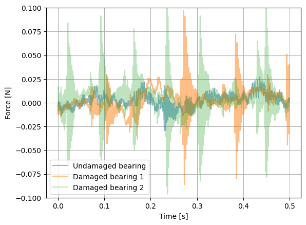
As an example of signal processing we can highlight the identification of bearing faults or the identification of dynamic properties of structures (e.g. damping, stiffness). In both cases we must process the measured signals correctly, even before we sample them in time and then quantize them (see 5. Data quantization). The figure below shows a measurement of the force on an undamaged bearing and on two damaged bearings (Slavič et al. [2011]). In the measurements we see certain differences, but can we identify the type of damage from the measurements? Furthermore, can we identify the size of the damage from the measurements? We will try to answer this and similar questions in this book.
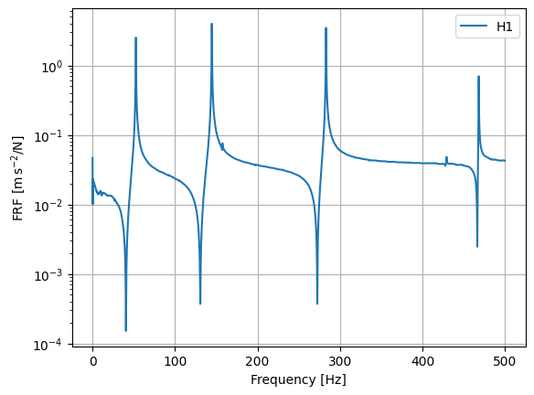
As a next example, the figure below shows the frequency response function (FRF), which in the frequency domain relates the excitation of a system to its response (the example is taken from the pyUFF package). Correct identification of the frequency response function is essential for the correct characterization of dynamic systems and is therefore also one of the fundamental learning objectives of this book.
What is a system?#
We usually try to describe dynamic and other systems on the basis of models, and to identify the model parameters with the help of experimental measurements that we process appropriately. The figure below shows an arbitrary system whose excitation is described in time by \(x(t)\) and whose response by \(y(t)\). As an example of the system excitation \(x(t)\) we can imagine a force acting on some mass, and as the response \(y(t)\) the voltage on an acceleration sensor or a sound-pressure sensor. The response is often measured via an electrical voltage that is usually proportional to the measured quantity (e.g. acceleration, sound pressure); of course, both the excitation and the response may also be related to other quantities that we can measure, e.g. current or the intensity of a picture element in an image (see Gorjup et al. [2021]).

The system, more precisely the linear time-invariant system, will be defined in detail in the chapter 4. Linear time-invariant systems with one degree of freedom.
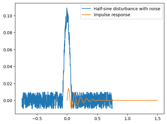
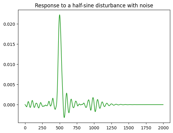
As an example, let us look at the response of a single-degree-of-freedom dynamic system to a half-sine disturbance with noise. The impulse response function of a single-degree-of-freedom system is defined as:
The concrete implementation and the result are shown in the code below.
So that we can understand systems in the time and frequency domains, we will first have to become acquainted with the Fourier series presented later (2. Fourier series) and the Fourier integral transform (3. The Fourier transform).
A system can be uniquely identified if we identify the frequency response function \(H(f)\) or its time-domain counterpart, the impulse response function \(h(t)\). If the excitation \(X(f)\) and the response \(Y(f)\) are known in the frequency domain, the identification is theoretically extremely simple: \(H(f)=Y(f)/X(f)\). In practice, the problem is that the measurement of the excitation and the response is burdened with measurement and other uncertainties. An example of a real system is shown in the figure below; \(n_x(t)\) and \(n_y(t)\) represent the noise on the excitation and response sides, and \(x_m(t)\) and \(y_m(t)\) the measured excitation and the measured response (with noise).

The measured excitation \(x_m(t)\) is obviously different from the one exciting the system, \(x(t)\), and the measured response \(y_m(t)\) is obviously different from the actual response \(y(t)\). Given the measurement and other uncertainties, we do not have access to the actual excitation \(x(t)\) and the actual response \(y(t)\), and therefore we cannot determine the frequency response function \(H(f)\). In the chapter Estimators of the frequency response function we will look at how to estimate \(H(f)\) on the basis of quantities that we can measure (\(x_m(t)\) and \(y_m(t)\)); we will then speak of the estimator of the frequency response function \(\tilde{H}(f)\).
Continuous/discrete signals#
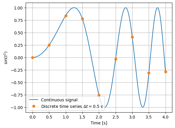
Engineering processes are usually continuous and we sense them with the help of various sensors that generate a physically measurable quantity, the so-called signal. A signal is a continuous quantity (sometimes we will also hear the name analog signal). Because we process the data with a computer, we discretize these continuous signals (see the chapter Uniform time sampling). Such discretization is usually done with a constant time step. The figure below shows a continuous signal and a discrete time series.
Classification of signals#
For the treatment that follows, the classification of signals will be important (adapted from Bendat and Piersol [2011], Shin and Hammond [2008]), as shown in the figure below.

We divide signals into:
deterministic signals \(-\) these are signals whose values in time are uniquely determined, and
random signals \(-\) these are signals whose value we do not know exactly, but for which we can determine a probability distribution.
An example of a deterministic signal is the function:
while an example of a random signal is a measurement of the surface height of a rough sea. When classifying signals we must not forget that we can have processes composed of a deterministic and a random part (e.g. a measurement of a product’s profile also includes a random measurement error).
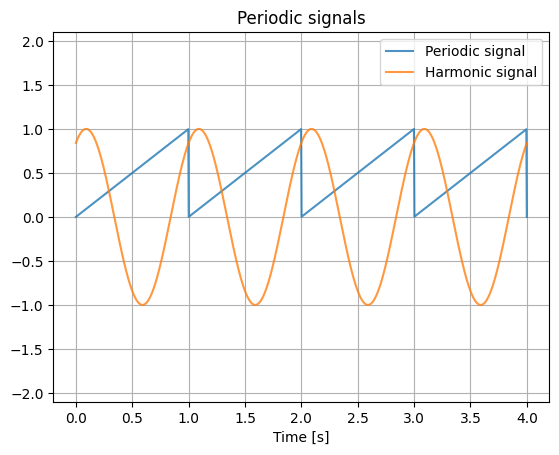
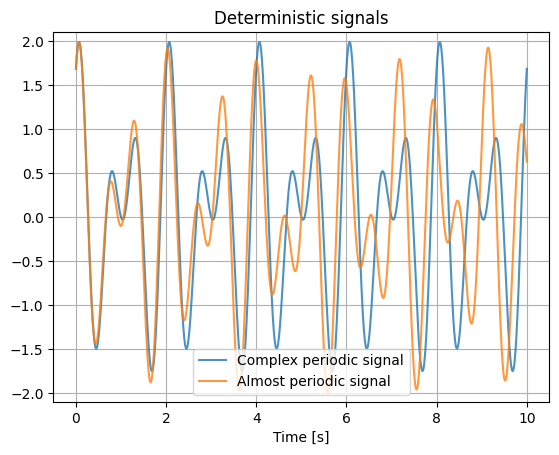
We further divide deterministic signals into periodic ones, which repeat after a certain time (a period), and those that do not repeat, i.e. aperiodic ones. Periodic signals are divided into harmonic ones, which are defined by a sinusoid of arbitrary phase delay, and complex periodic ones, which are defined by a sum of several harmonic components. For complex periodic signals it is important that the ratio of the frequencies of the harmonic components is a rational number, since in that case the signal repeats with the least common period. If the ratio of the harmonic components is not a rational number, we speak of almost periodic signals, which belong to the group of aperiodic signals. This group also includes transient and chaotic signals.
Understanding the periodicity of signals and the influence of aperiodicity on the Fourier series (2. Fourier series) and the Fourier transform (3. The Fourier transform) is of key importance for correct interpretation in the frequency domain.
We further divide random signals according to whether the statistical distribution that defines the random processes changes with time (non-stationary) or does not (stationary); we will deal with this in more detail in the chapter Moments of the probability density function.
Some examples of deterministic signals#
The figure below shows periodic signals: first a triangular signal that repeats with a period of 1 s, then a harmonic signal that likewise repeats with a period of 1 s.
The last signal represents a complex periodic signal \(-\) these signals are composed as a sum of several harmonic components; the period of the one in the figure is 2 s.
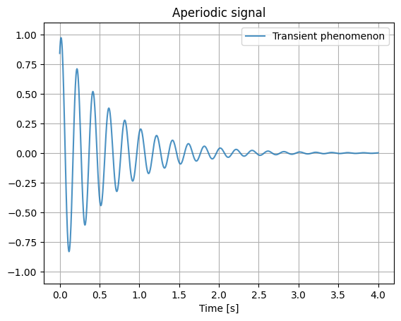
For aperiodic signals, we will show as an example a transient signal that arises when a dynamic system is excited by an impulse disturbance.
We will not treat chaotic aperiodic signals in more detail here; for them it holds that, because of their high degree of dynamics, they can be reliably predicted only for a relatively short time ahead, after which their behavior seems increasingly random.
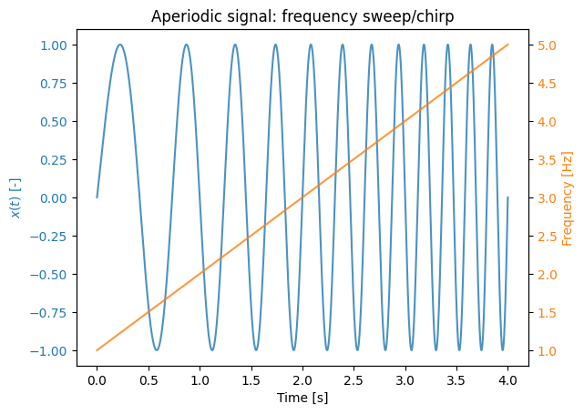
When exciting dynamic systems we often use a frequency sweep (also called a chirp); below, a 4 s long linear (the frequency increases monotonically) chirp from 1 to 5 Hz is shown.
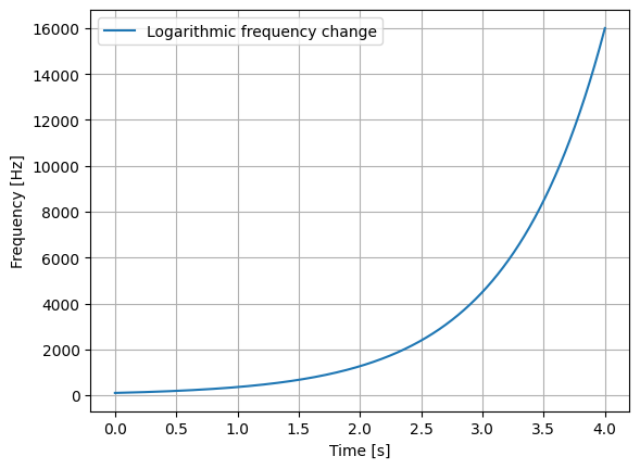
When analyzing signals it sometimes helps to hear them; below we can hear a 4 s long logarithmic chirp from 100 to 16000 Hz.
Some examples of random signals#
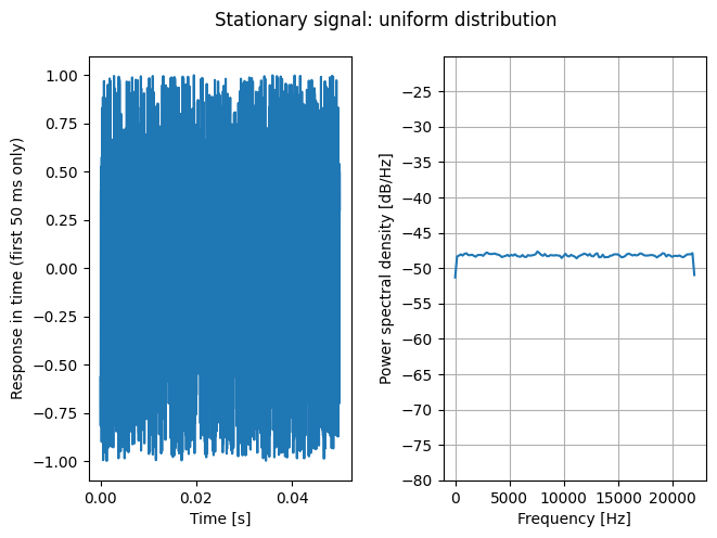
The figure below shows a random signal with a uniform distribution. The left-hand figure shows the first 50 ms of the data in time, while the right-hand figure shows the power spectral density (see Power spectral density (PSD)). We can observe that, in the frequency domain as well, the uniform distribution has a relatively constant power across the entire analyzed frequency range (the data are generated with a sampling frequency of 44 kHz).
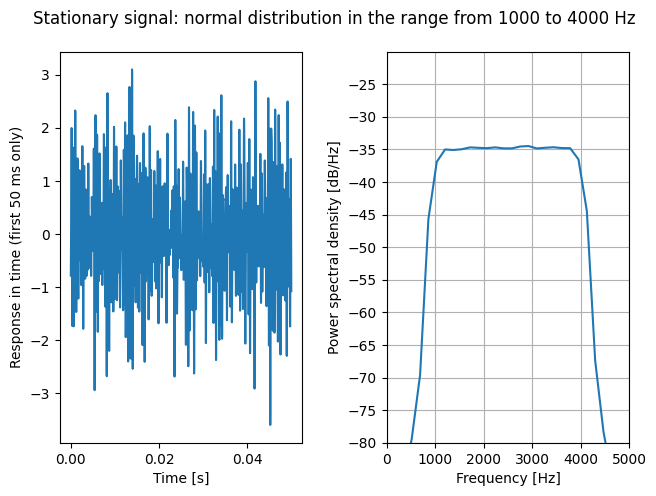
Because the energy is distributed across a (too) wide frequency range, exciting dynamic systems with a uniform distribution is rarely appropriate. We usually use a normal (or Gaussian) distribution with a defined frequency spectrum. The figure below shows a normal distribution with uniform power density in the frequency range from 1000 to 4000 Hz.
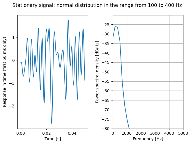
For comparison, let us also look at a normal distribution with uniform power density in the frequency range from 100 to 400 Hz.
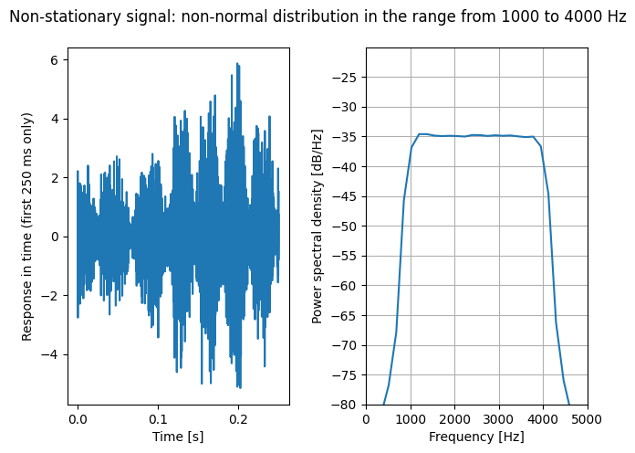
Let us also look at a non-stationary signal. We start by preparing a stationary signal with uniform power density in the frequency range from 1000 to 4000 Hz and a non-normal distribution (with a kurtosis parameter = 5). We then modulate the stationary signal with a carrier signal in the frequency range from 10 to 20 Hz in order to obtain a non-stationary signal. Even though the power density is distributed similarly to above, the non-normal and non-stationary signal usually sounds considerably more unpleasant; in the case of vibration fatigue, non-stationary loading is usually also considerably more damaging.